Data is one of the most important assets for an ecommerce business. Since an online retail business provide products or services through the internet, their digital nature presents them with the opportunity to collect a wealth of data. This data should be leveraged to gain actionable insights to make well-informed, data-driven decisions to drive growth.
Dashboards are a crucial part of the data analytics process by providing a digestible, visual display of data. They allow you to keep substantial information right at your fingertips through an overview of key metrics. Decision makers can gain deep insights and come to conclusions without having the need to delve into raw data.
In this article, I’ll focus specifically on how you can use marketing data to ultimately boost growth for your business.
Why Marketing Needs Dashboards
Ecommerce marketing plays a big role in driving growth for the business. Marketing efforts attract attention and action to a business, grabbing people’s interest and pushing them down the purchasing funnel.
The ecommerce industry has many options when it comes to marketing. Social media marketing, content marketing, search engine marketing, and email marketing can all be utilized in the effort to attract customers. With so many marketing channels and tools for each, teams can be bogged down by a deluge of data from disparate sources.
There are tens, even hundreds, of ways to bring traffic to an ecommerce store. Any small detail of any channel has the potential to impact your business’ bottom line and ability to grow. It’s important to be aware of what’s happening so you can take action.
This is where dashboards come in handy. It can be hard to juggle data from many sources. If your advertisement, SEO, CRM, and social media data are all on separate platforms, it can be nearly impossible to get a big picture overview of what’s actually happening. For instance, data and insight collected from content creation can be contradicted by your SEO data.
To develop the best strategy for growth, it’s essential that all of these moving pieces are put together.
By presenting your information in a dashboard, managers can make faster decisions using up-to-date data from various sources. Empowering them with this data leads to better decision making that streamlines your business processes and drives growth.
What Kinds of Dashboards Can be Made?
To understand how your marketing is making an impact, it’s important to consider a customer’s journey. Dashboards can be created to provide an overview of your business’ performance at each stage of the funnel as well as drill down into the details of each channel or campaign.
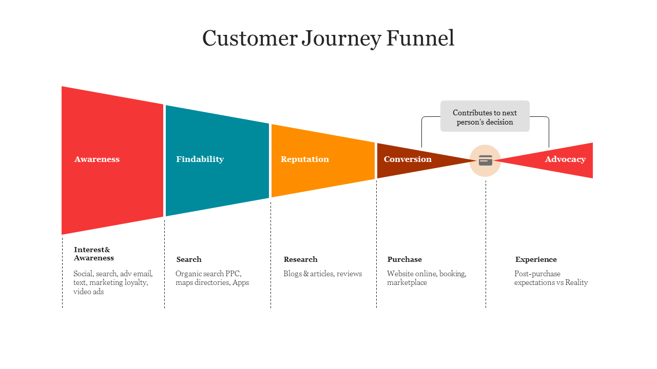
You can create a dashboard that gives you an overview of your business’ performance from awareness to conversion. By giving you a big picture view, it can help you understand the effectiveness of your marketing efforts as a whole.
You can create other dashboards that help you zoom into each stage of the funnel. For example, generating awareness can come about through various channels such as social media or paid ads. By creating a separate dashboard to understand this stage of the funnel, you can further break down the impacts of your marketing efforts. This can help you make decisions by giving you a clear, visual comparison between metrics.
By having all of these dashboards in one place, you can make more informed decisions quickly. Not only do you have an overview of your performance, you can easily find more details to guide your decision making.
Ultimately, the dashboards you choose to make should be in line with what findings you are hoping to make. With that in mind, let’s get into some examples of dashboards you can create and how you can use them to drive growth.
1. Marketing performance dashboard
This dashboard is great for monitoring overall performance across all channels. You can organize your marketing activities, understand their impact in relation to each other, and hone in on areas that are or aren’t performing well.
Metrics to include
Average order value: Knowing the AOV can help businesses with marketing and pricing strategies to drive up the value. For example, you can offer free shipping for orders over $100. By increasing AOV, businesses can directly drive revenue growth.
Conversion rate: Conversion rates give you an idea of how successful your strategies are at getting visitors to engage with your site. The goal is to push visitors to the next stage of the customer journey, and conversion rates let you know how successful you are.
Customer retention rate: Monitor customer retention rate to see if your customers are coming back. Determine what’s causing them to leave and what’s convincing them to stay.
Customer lifetime value: Building a brand is key for ecommerce businesses. Focusing on CLV means focusing on increasing the value of each customer and improving their experience with your brand. CLV encompasses AOV, conversion rate, and customer retention rate. Using those metrics in conjunction can help you decide where to invest for CLV growth. Segmenting by channel can also help you determine which are the most profitable.
Cart abandonment rate: Lowering cart abandonment rate can increase revenue. Fixing a high abandonment rate can mean reviewing the checkout process and shipping costs.
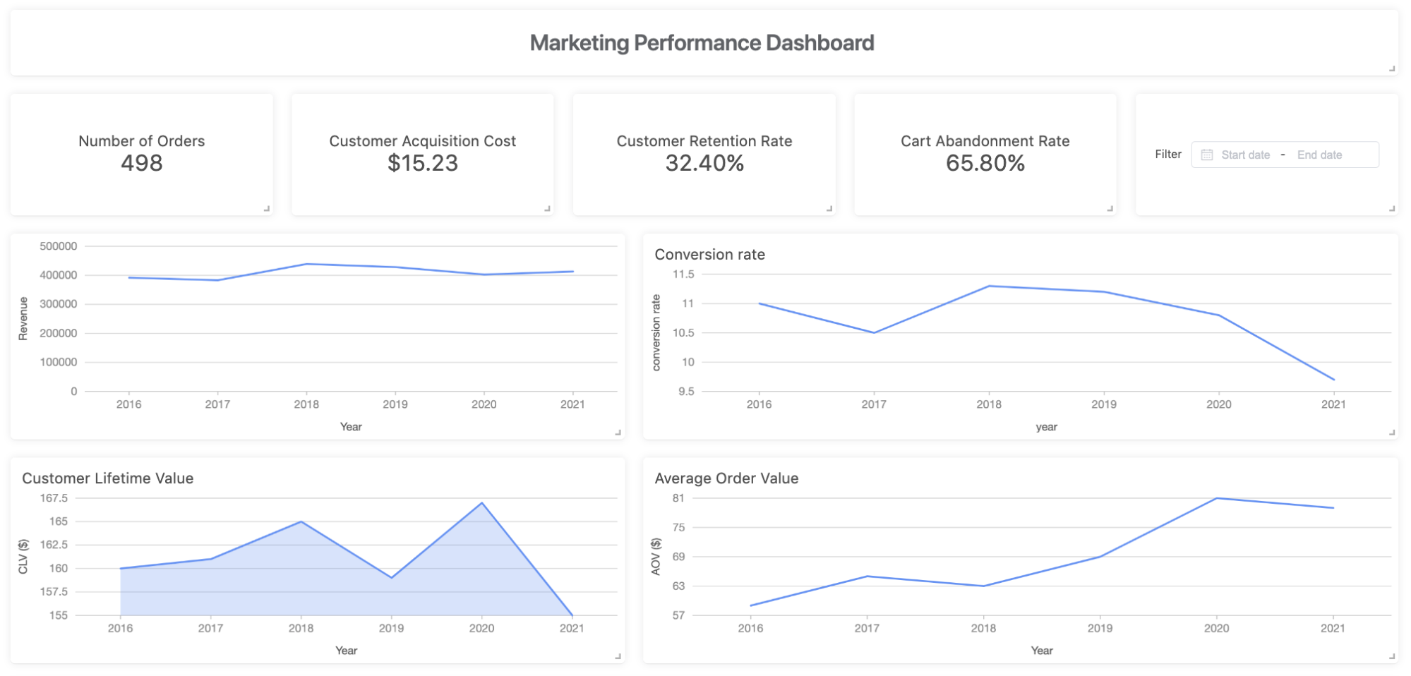
Driving growth
In a dashboard, these metrics can be used in conjunction to draw more nuanced conclusions. For example, this dashboard shows that the conversion rate has been decreasing while the average order value is increasing. The dashboard can help us determine what needs to be improved. We see AOV is increasing, but revenue is not following the same trend, suggesting that we should focus on increasing conversion rates.
2. Website analytics dashboard
Ecommerce stores, being digitally native companies, heavily rely on their website to reach customers. After creating awareness for your business, the website is likely the first place potential customers will go to.
With websites playing a large role in ecommerce, it’s important to know how customers are finding your website and to understand their experience on it. It’s essential to know who your audience is, how they interact with your site, and their customer journey. Metrics included in this dashboard should support these purposes.
Metrics to include
Bounce rate: Bounce rate is the percentage of visitors who leave your site after visiting one page. This rate is important to track to understand which pages on your site are performing well and why customers are leaving your site.
Visit length, pages per visit, and page flow: These metrics help you understand how users are interacting with your site and which pages they’re visiting.
Conversion rate: You can track rates for conversions, such as ad clicks or page views. Tracking these rates can help you determine what ads or pages are working and what’s not.
New or returning visitors: Understanding when people visit your site and whether they’re new or returning visitors is important. You want to make sure you’re maintaining a healthy number of returning visitors while requiring new ones.
Traffic by device and by source: It’s not sufficient to just track traffic to your site. It’s also important to understand how visitors are accessing it and from where they are coming from. For example, if your customers are more often using their mobile devices to visit your site, it might be worthwhile to improve your mobile site. The source of traffic can also help you target customers. How much of your traffic is organic? From social media? From paid advertisements? Knowing the breakdown can help you target certain channels.
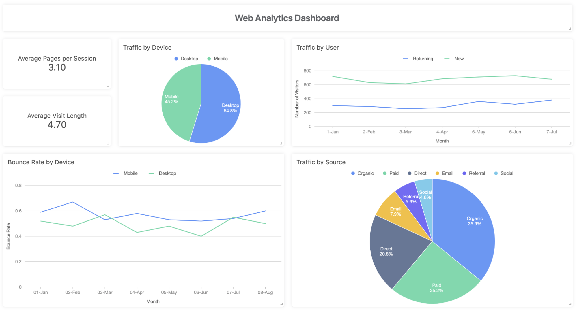
Driving growth
This dashboard can help you determine what’s working and what’s not working in terms of driving traffic to your website. In this dashboard, we can see that in general, the bounce rate is higher for mobile visitors than desktop. Mobile users make up over 45% of traffic, so it could be worthwhile to determine why the bounce rate is higher for them and develop strategies to improve it. Maybe you don’t have a mobile site yet, or your mobile site needs to be developed to be more user-friendly.
3. SEO performance dashboard
A Search Engine Optimization (SEO) dashboard can complement a web analytics dashboard by displaying key metrics to track and monitor performance of your website from organic search.
SEO is a data heavy, technical process. A difficulty that comes with SEO is that its impact is usually not immediately measurable, since it can take months for marketers to see the impact of an SEO campaign. A dashboard can help you frequently check on your metrics and track any changes that happen.
Metrics to include
Conversion rate: Determine a conversion event and find the conversion rate from organic traffic. This number can give you a good idea of your SEO strategy’s success.
SEO traffic: One of the main goals of SEO is to drive more traffic to your website. SEO traffic, or organic traffic, shows how many visitors are coming from their search engine results.
SEO ranking change: A website’s keyword rankings are important for pushing a webpage up in the searches so customers can find it. Tracking SEO ranking of your website can help you understand trends of your SEO performance and where your website ranks.
Site audit score: A site audit score can help you quickly identify technical errors that are negatively impacting your SEO ranking. It includes errors such as duplicate content, load times, and server errors.
Top landing pages: Landing pages are the first pages visitors see on your website when they click on an ad. These pages can make or break your conversion rate, so it’s important to track your top pages to determine what landing page strategies are working for you.
Change in backlinks: Having backlinks to your website is important to build authority and improve your ranking. Keep track of how many backlinks you’re gaining or losing over a period of time. This can help you hone your outreach strategy.
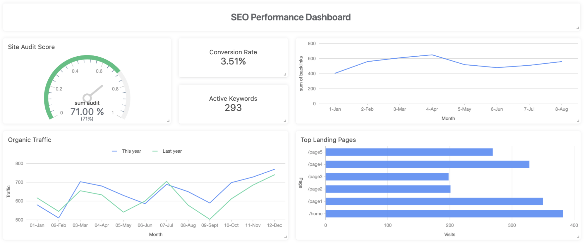
Driving growth
Looking at the top landing pages can help you develop strategies to drive growth. For example, we see that /page2 and /page3 have fewer visitors. We can examine the strategies on those pages as compared to the others to determine why there’s less traffic. Maybe there’s not a clear CTA or the keywords aren’t as relevant as they should be. You can adjust your strategy and see how it changes your landing page traffic, overall traffic, and conversion rate, all on the same dashboard.
4. Paid advertising dashboard
Advertising dashboards can help you combine data from all of your advertising campaigns. You might be running ads on Google, Facebook, Instagram, and/or other sources. Advertising usually comes with a large volume of data for you to monitor your campaigns and can be tricky to navigate.
This dashboard can provide a single view of metrics across sources so marketers can see how their campaigns are performing and plan optimization strategies.
Metrics to include
Total spend by campaign, source: Track total spend by campaign and source to make sure your budget is being used efficiently.
Impressions by campaign, source: Impressions are important to be aware of. It can give you insight into how your ads are performing. If impressions are low, the ad may need to be reworked to improve framing or content.
Cost per click by campaign, source: CPC is how much it’s costing you each time a visitor clicks on your ad. This is important to track to make sure you’re not overspending on advertisements. If you notice high CPC for an ad, it might warrant additional analysis to make sure that running the ad is worth the cost.
Click through rate by campaign, source: When you put out an ad, one of your goals is to get the reader to click on the call-to-action (CTA). Use this metric to determine what campaigns or sources are successful and why so you can adapt to improve your click through rates.
Conversion rate by campaign, source: Conversion rates are important because you want to make sure that your ad is effective in helping you achieve your goals. You can discover which campaigns or sources are delivering the best conversion rates and develop strategies accordingly to improve conversions across the board.
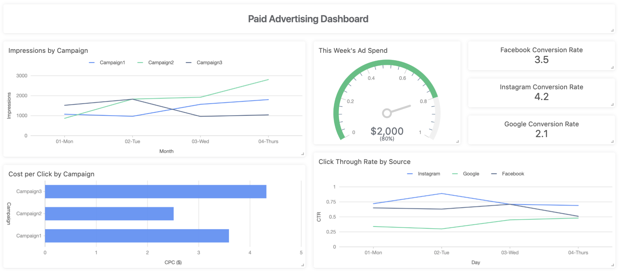
Driving growth
You can easily compare performance between campaigns or sources on this dashboard. For example, not only is Campaign2 getting more impressions, it also has the lowest CPC. Seeing this information side by side can help you decide to either pivot strategies for other campaigns or to put more resources into Campaign2. This will help drive visitors to your site and improve your conversion rate and revenue.
5. Email campaign performance dashboard
Email campaigns are a great way to build relationships with potential and existing customers. An email campaign performance dashboard can give you insight into how your email campaigns are performing and how you can improve your business’ email marketing strategy.
Metrics to include
Open rate: Keeping track of open rates for email campaigns can give you insight into what’s working in your email subject lines. Some email campaigns may be underperforming due to few people opening the email. Discover which subject lines are working and adjust accordingly.
Click rate: When you put out an email, you want to make sure that your subscribers are actually opening it, reading the content, and clicking the links. This metric can be used in conjunction with open rate to better understand your recipients’ behavior.
Conversions per email: Similar to ad conversions, it’s important to make sure that people are not only clicking on your ad, but are actually taking action further down in the funnel. You can determine which emails are leading to higher conversions and figure out what’s working and what’s not.
Number of unsubscribers: By tracking the number of unsubscribers, you can gain more insight into how people are responding to your emails. If you notice that you’re losing subscribers, you can then work to pinpoint why they are leaving and how you can retain them.
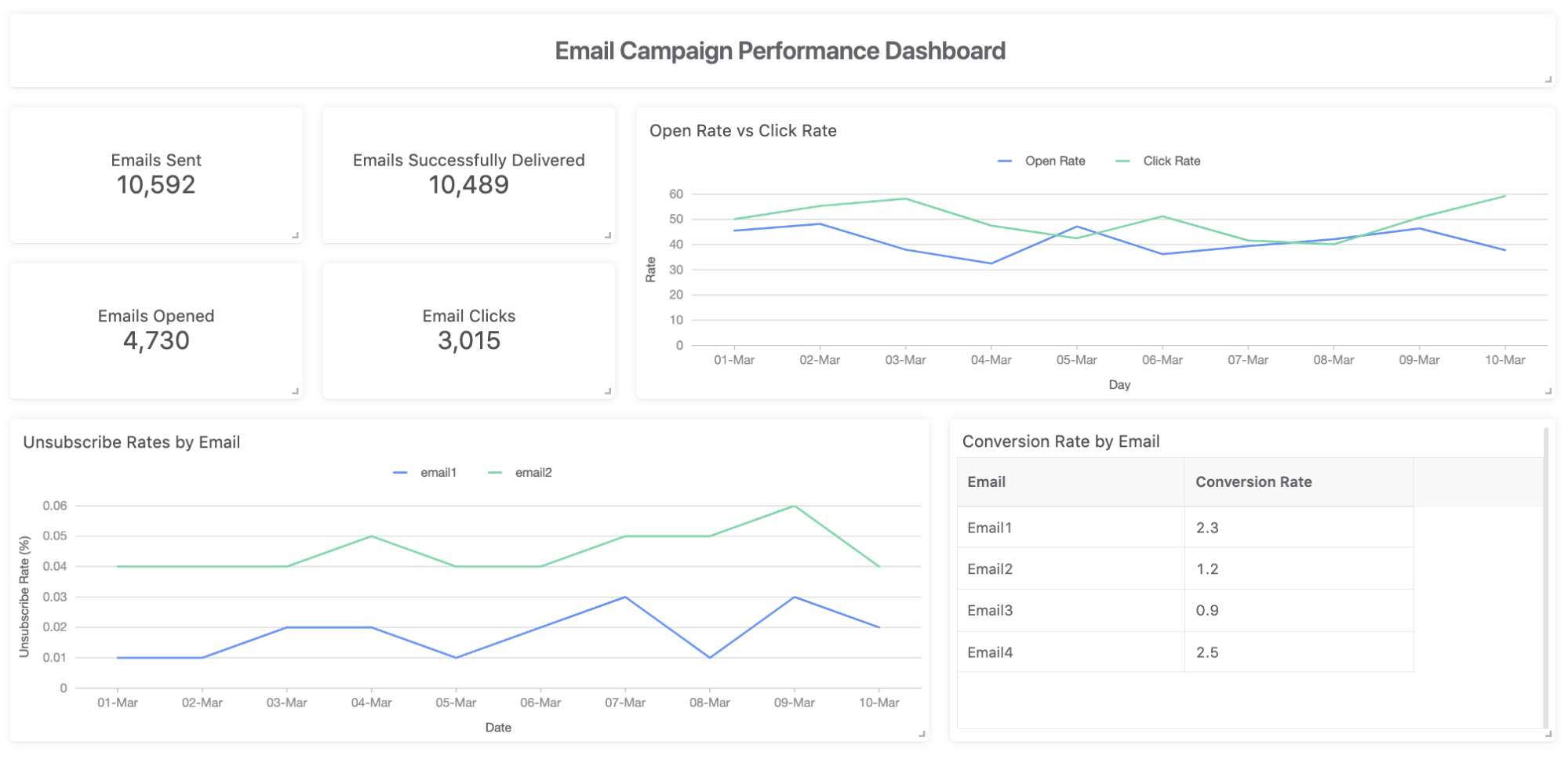
Driving growth
How might you use this dashboard? Understanding email campaign performance is important to develop strategies that work. Here, we can compare unsubscribe rates between email campaigns. The unsubscribe rates for Email2 are higher, suggesting that reception to this particular email isn’t great. We can also see that conversion rates for Email2 are on the lower side. These metrics both suggest that this email is underperforming, and possibly even harming your business. We can then analyze the difference in content, subject line, and format between Email1 and Email2 to develop strategies to improve email performance and drive engagement.
Dashboards can be used in many ways to drive growth for your business. Ultimately, you want to make sure you’re understanding how your customers are moving through your funnel and how you can improve their experience at each stage. These examples are just a taste of how you can use dashboards to visually display your data in order to quickly extract key findings and make decisions to improve your strategy.
Contact us in the chatbox on the bottom right corner of this page if you have any questions!
- Schedule a Discovery Call
- Chat with Acho: Chat now
- Email us directly: contact@acho.io