For a better reading experience, the following is the reference to different objects on Acho:
🔤: Variable | 🔘: Button | 📋: Table
Good customer retention helps businesses keep valuable customers and create recurring revenue streams. It’s arguably one of the most important metrics in any business across industries. The problem with customer retention is that most strategies may only have temporary success, fewer strategies actually have long-lasting benefits.
This is because customer retention is usually caused by multiple factors, rarely it is determined by one single aspect of the business. For example, higher retention rates may result from a new product launch or a successful marketing campaign. Though it could regress to a previous state soon after.
Moreover, customer behaviors can be sporadic. A certain use case or need may resurface after several months if certain events occur. Businesses have no full control over what a customer may see or experience outside of their product offering.
To determine which strategies actually work, it is important to observe how different strategies influence the change of retention rate for a longer period of time. Cohort analysis is one of the best ways to reflect how well a product retains customers.
What is Cohort Analysis?
Cohort analysis helps segment customers based on certain traits or behaviors, it then maps out a trend on how these cohorts retain over time. Generally, acquisition time is the most common method to segment customers by groups. For example, you can group customers by their respective first purchase times in e-commerce. In SaaS, you can group customers by their registration time or payment date.
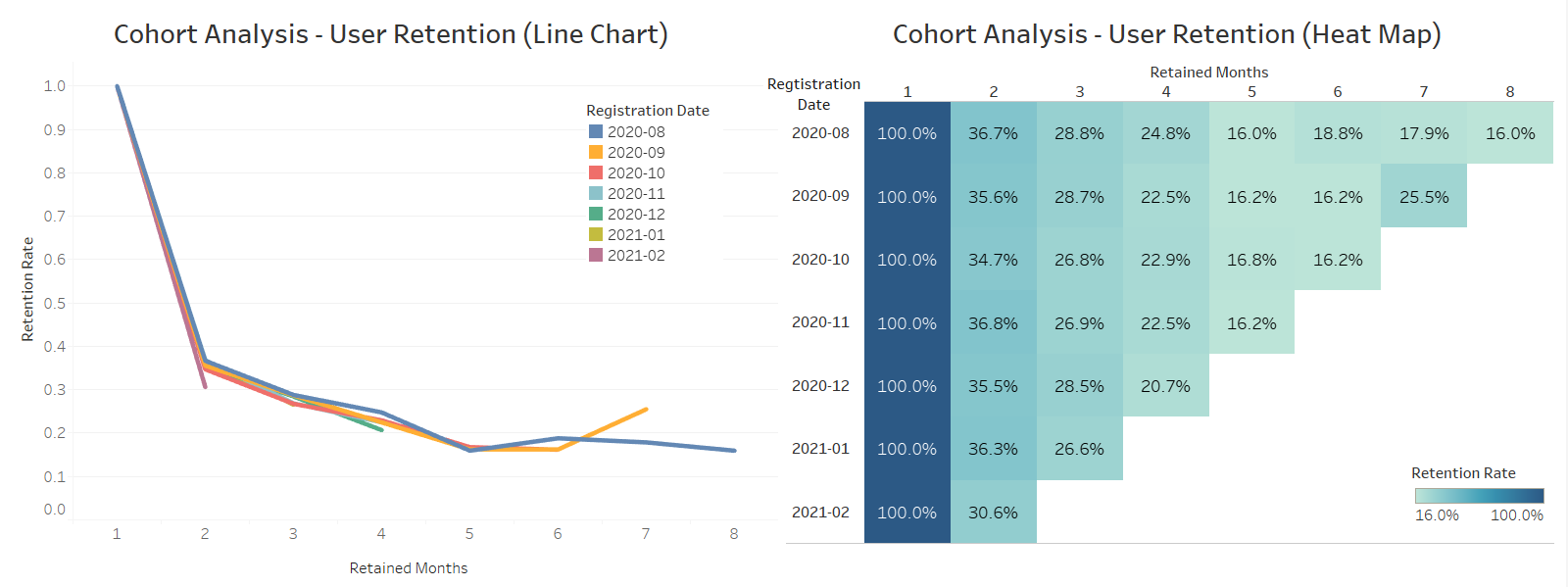
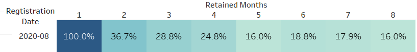
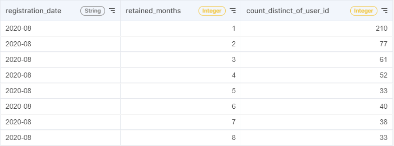
Take the following graph as an example. This cohort is extracted from the heat map provided above. It represents the change of retention among users who registered in August 2020. The first month had a 100% retention rate since all users registered at this time. In the second month, the retention rate dropped to 36.7%. That indicates 36.7% of users who registered in August 2020 kept using the product after a month. After 8 months, you can find the retention rate decreasing to 16.0%. It means that only 16% of all users in this cohort came back to the product.
The reason to divide customers into different groups based on their acquisition time is to isolate impacts of marketing campaigns, sales strategies, new products, or features. If a customer started to purchase or use a product in the same time period, they would probably have received the same message, experience, or marketing effect, and enjoyed the same set of features or services. Therefore, we can evaluate the combined effects of several marketing tools or sales strategies on customer retention.
Generally, cohort analysis can answer the following questions:
- Who are your customers?
- When did your customers churn?
- Why do they stop purchasing or using your product?
How to run a cohort analysis?
Here we use a SaaS company’s user behavior data as an example to conduct a cohort analysis. Although your data may not have the same schema as the example dataset, you only need to ensure that your dataset includes information that can be used for identifying individual users (such as user ids) and the timestamp of their purchase time(such as login time or purchase date).
1. Import data from your database
There are two tables in this case. To do the analysis, we only keep necessary columns in advance.
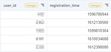
The first table is 📋 users. Each row includes a user's id and registration time. It can help you identify their acquisition time.
- 🔤 user_id: a unique id for each user.
- 🔤 registration_time: 10-digit UNIX timestamp for each registration
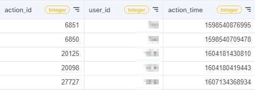
The other one is called 📋 user_actions. It records each action that a user applies in the software. The 🔤 user_id suggests who is the user that has applied the action. The 🔤 action_time suggests when did he/she apply it.
- 🔤 action_id: a unique id for each action
- 🔤 user_id: a unique id for each user.
- 🔤 action_time: 13-digit UNIX timestamp for each action.
*If you do not have a user’s registration time recorded in your database, alternatively you can use their first purchase time or login time. Both can be used to calculate retention. For more information, check out this article.
2. Combine two tables
Click the 🔘 Join button to combine these two tables.
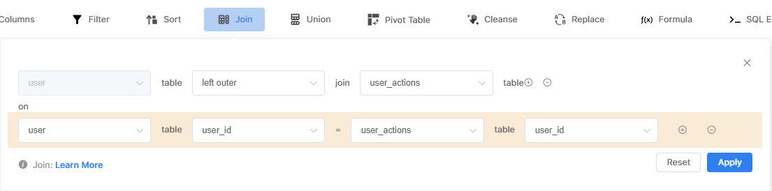
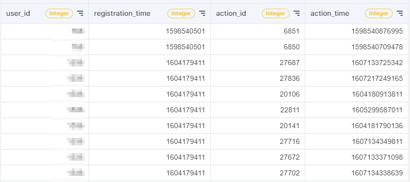
The result table should have columns as such:
3. Transform the UNIT timestamp to a standard date format
As you can see, 🔤 registration_time and 🔤 action_time are presented in a series of digits (called UNIT timestamp) and it's difficult for human interpretation. You may use the 🔘 Formula feature to transform them into a readable format.
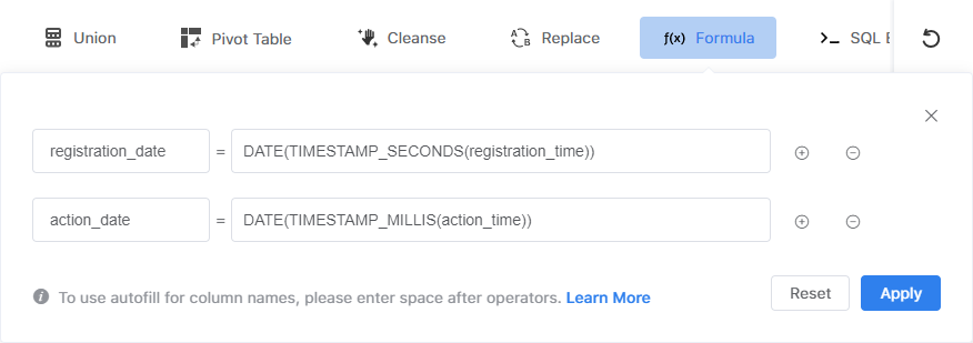
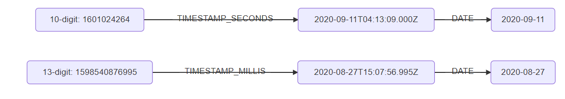
First, using TIMESTAMP_SECONDS() or TIMESTAMP_MILLIS() can convert the UNIX timestamp into a standard timestamp. Basically, TIMESTAMP_SECONDS is used for a 10-digit UNIX timestamp and TIMESTAMP_MILLIS is used for a 13-digit UNIX timestamp. Next, applying DATE() on the timestamp can change it into a “yyyy-mm-dd” format.
The following chart illustrates how these functions work:
4. Calculate how long a customer has retained
In cohort analysis, we need to know whether a user keeps using a product, so we can evaluate the retention rate over time. In other words, we have to know when each action happens in what month since the user first started.
To calculate it, let's click 🔘 Formula again and type in the following formula.
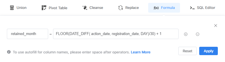
First, DATE_DIFF() function can be used for calculating the interval between two dates. By specifying DAY in the function, it will return the difference in days.
Second, to recognize which month did each action accur, you can divide the number of days by 30. Finally, using the FLOOR() function it can get only the integer part of numbers.
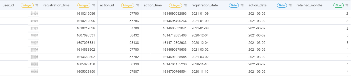
Here is the result:
* Important note: the 🔘 Formula action cannot be applied in succession. Use a filler action(Sort, Move Column, etc) in between 2 🔘 Formula actions.
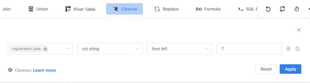
Finally, use the 🔘 Cleanse action to convert 🔤 registration_date into months.
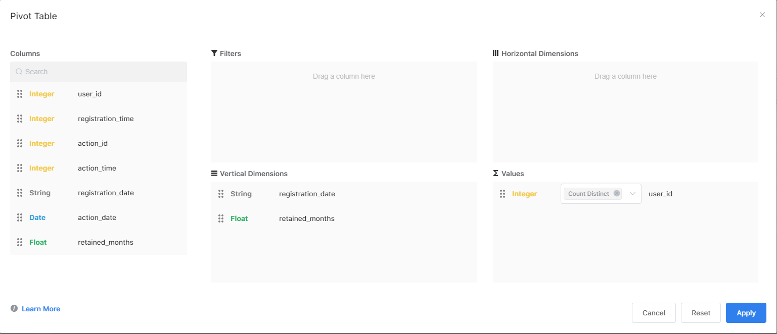
5. Calculate the number of retained users in each cohort by month
Click 🔘 Pivot Table, drag 🔤 registration_date and 🔤 retained_months into Vertical Dimensions, and put 🔤 user_id in Values to count the number of different users.
Here is the result.
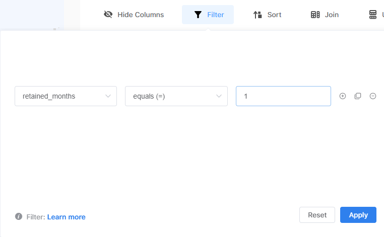
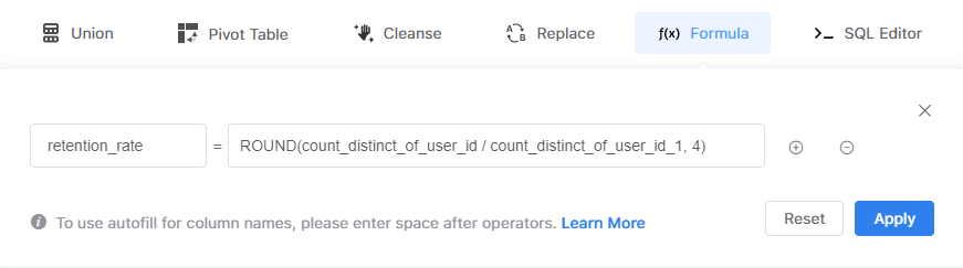
6. Calculate retention rates
First, create another table called 📋 user_1 and apply the previous 5 steps. Next, click 🔘 Filter to keep only the rows with 🔤 retained_months =1.
Then, go back to the first table and click 🔘 Join to combine tables.

Finally, click 🔘 Formula to calculate the retention rate.
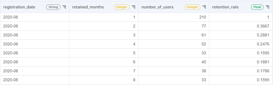
The cohort analysis table is now all set.
7. Export to Visual Panel and visualize the results
The last step is to produce a chart with your table. Acho offers a built-in tool called Visual Panel for this. You can also connect your Acho table to your favorite BI tools such as Tableau and Metabase.

Generally, cohort analysis can be presented in a line chart or a heat map. If you want to examine the trend of customer churn, the line chart can give you a clear picture of the pattern. For example, from the top-left graph, you can see all retention rate lines drop significantly in the second month and the declining trends become flat after that.
If you want to see if there is any group with an exceptionally higher retention rate in a specific month, a heat map should help you discover it much easier. For instance, from the above heat map, you can see that users who registered in September have a higher retention rate after 7 months.Finally, if you want to create a real-time dashboard to update numbers automatically, you can check out this article to set up Data Sync.