If you’re using MongoDB Compass, MySQL workbench, pgAdmin or some other visual database management tools, you probably wonder why it is so hard to use them for advanced data analytics.
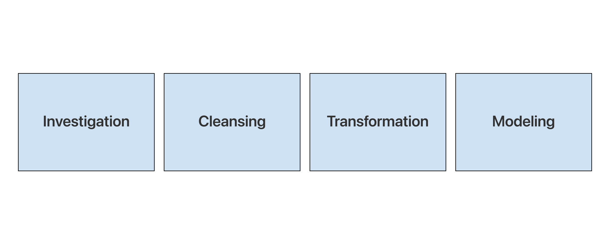
First, let us define what analytics are. Data analysis is essentially a process of digesting and manifesting information. The process includes investigating, cleaning, transforming, and modeling data. Ultimately the goal is to support decision-making.
Why are database GUIs not built for analytics?
For a good data analysis tool, it needs to support the 4 steps above efficiently. For database GUIs on the other hand, they are not built for cleaning, transforming or modeling data. The reasons can be summarized as the following,
Dedicated servers have limits when it comes to processing big data
If you have tens of millions of data, querying it can take longer than 30 seconds and lead to server connection timeout. Since you can only configure one server for a SQL database, your querying speed is limited. With distributed computing however, you can time-share your processing with hundreds of computers on cloud and therefore process terabytes of data.
Database GUIs are not built for data preparation/cleansing
Most database GUIs allow you to manipulate data by SQL queries: these SQL queries, however, are not intuitive and do not provide instant feedback. First, you cannot see what the data table looks like at the first glance. You need to write queries to unveil the data. Second, the nature of the SQL interface makes it difficult to cleanse the data due to the learning curve of the SQL and the mechanism of coding. Not only do you need to understand how to code, but you also need to put the queries all together and make sure they will work. Otherwise, there is no way for you to do sequential data transformation/cleaning through those database GUIs.
Advanced analytics require data pipelines
It’s harder to explore a dataset when it’s all hidden on a server. Some ETL tools actually address this by laying out analytical steps graphically, and progressively. Without a data pipeline, the data cannot get updated when the database changes, which makes the analytics(dashboards, charts, etc) static and are only for one-time use. In this case, the values of analytics are almost next to zero.
How do you analyze data from database
Then the question is “how do you analyze data from a database?” Take Acho Studio as an example:
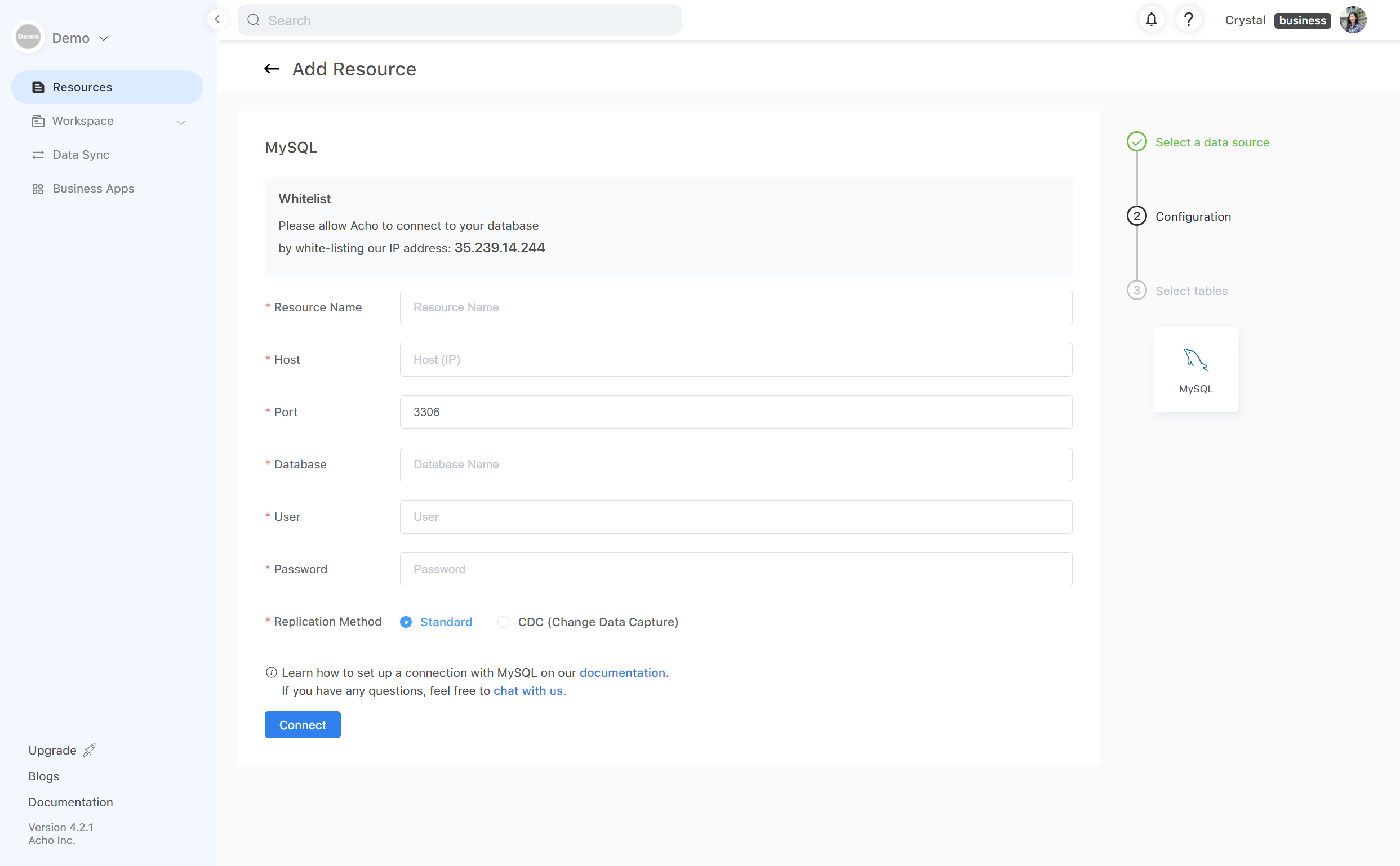
1. Set up connection with a database
First, verify your database credentials and whitelist Acho’s IP address to set up a connection. If you’re the Administrator of the database, this step is quite easy. If you’re a reader or some other role, contact your database administrator to complete this step.
Once the connection has been verified, it would take only a couple of minutes before you can load a table into Acho Studio. Some databases may take longer than others, depending on the size of your database.
2. Clean and prepare the data feeds
Now you have the database connected to Acho Studio, you can load a table into Acho Studio. In this step, your goal is to make sure that your data is clean, structured and efficient (small) enough for analytic projects. For example, you have a raw table that contains 2 million records, try using the pivot table or filter to drill down to the range of records you want to analyze.
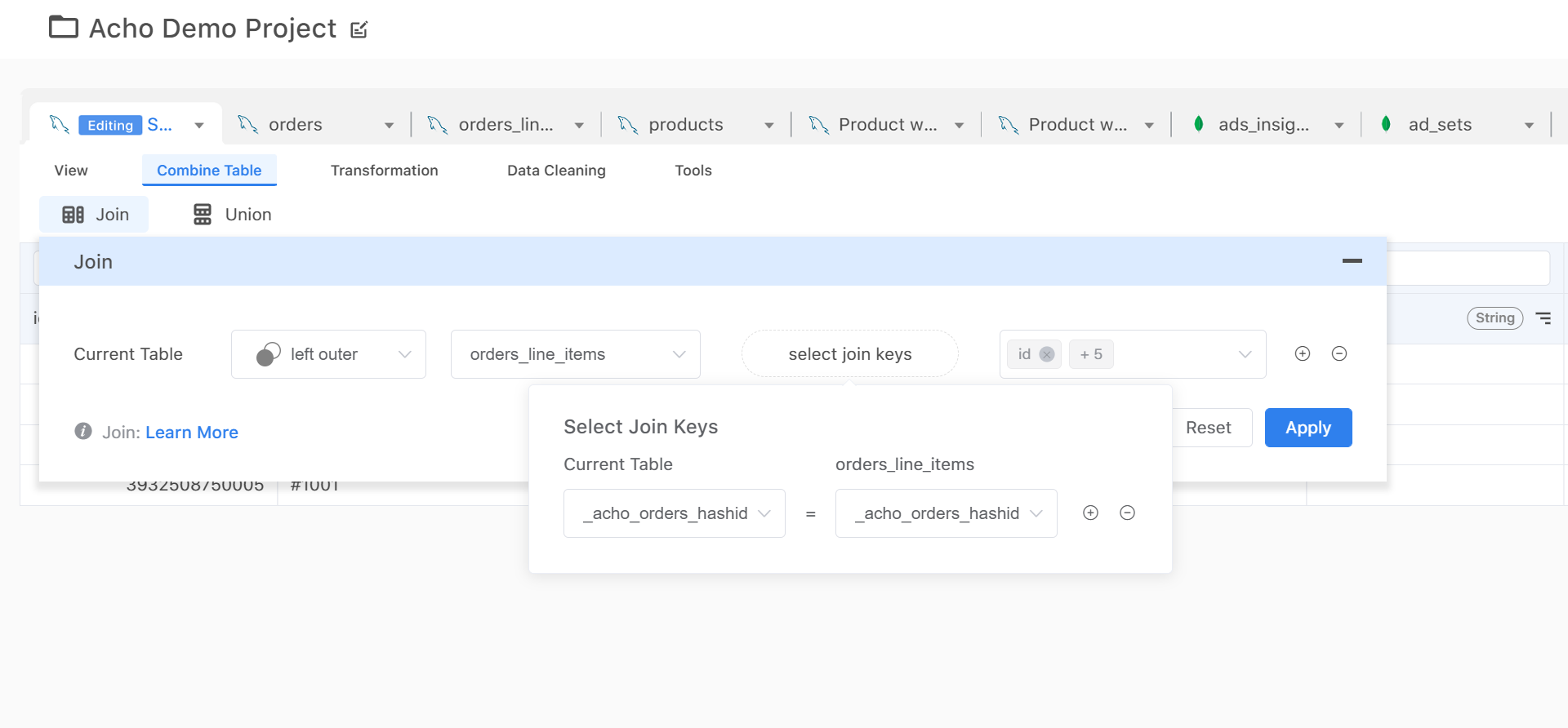
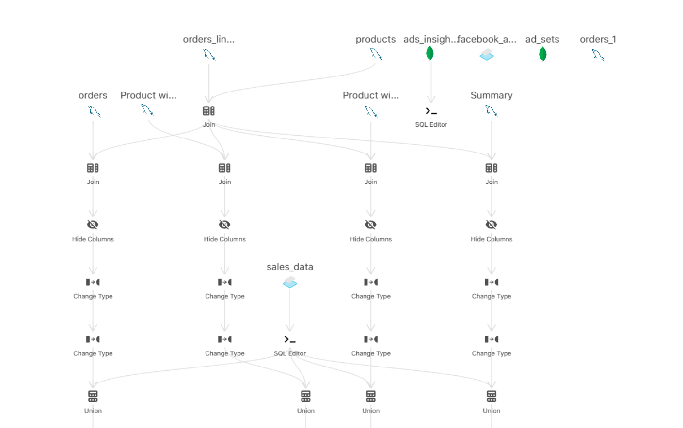
Of course, if you have a number of tables coming from different sources like the one shown below, you can also join/union multiple tables together by using a key column.
3. Build a data pipeline (data sync)
The next step is to build a data pipeline by applying your transformations in sequence. For example, you might want to create a new column based on a sum of existing columns. An action called “Formula” can come in handy. Then you might want to filter out certain values in this newly created column, you would use another action called “filter”. Now, you would’ve made 2 actions in your original tables, hence a simple pipeline is now formed.
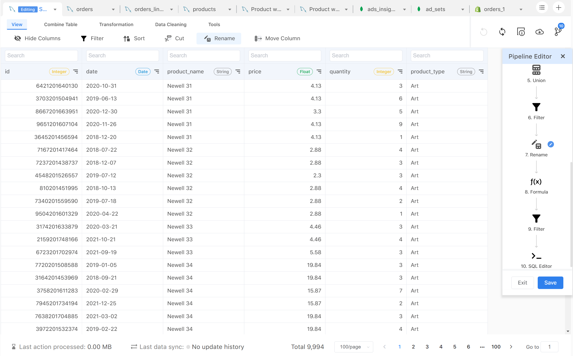
Once you have constructed your desired table, you can use the “pipeline” feature to visualize the relationship between the tables you have connected. Now, you essentially have built a transformation model for your data resources. There is really no limit to what you can do here.
4. Visualize your insights
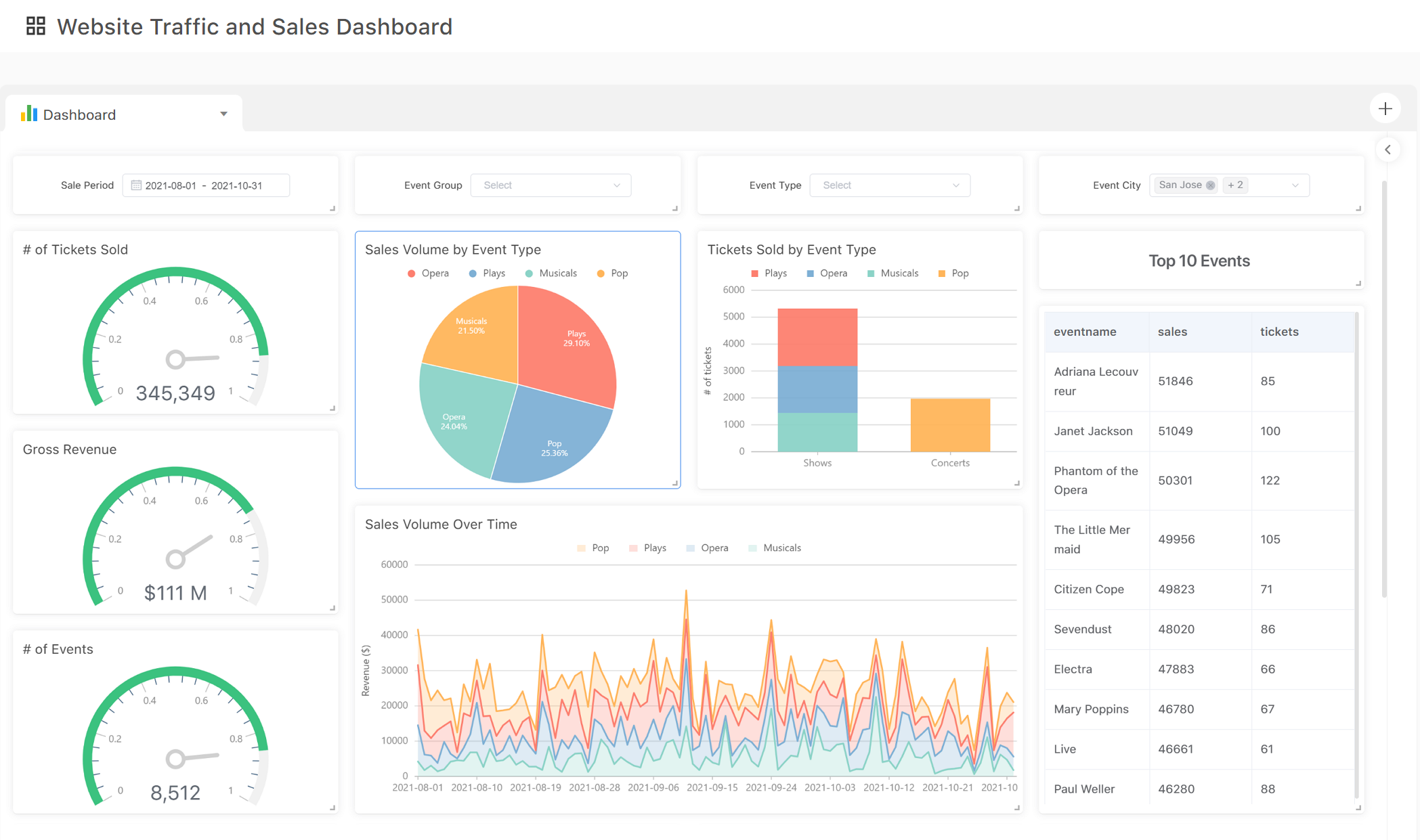
Once all data is prepared and synced, you can start visualizing your data in the charting app. There are many charts you can build to explore your data and present your insights. At Acho Studio, each visualization is connected to a specific table in a project. Whenever you table updates, your chart will update as well.
5. Manage your data pipelines
Once you have all the pipelines set up, it’s important to monitor their updates and status. If your database is in production, data records might change unexpectedly and cause breakage in pipelines. If your database has multiple accesses for writing and editing, someone might change your database’s schema and cause breakage. If your database’s server experiences a downtime, your pipeline might break as well.
After importing your databases to Acho, you can manage your databases in “Data Sync”. Here you can have a holistic view of all the pipelines available for your project table.
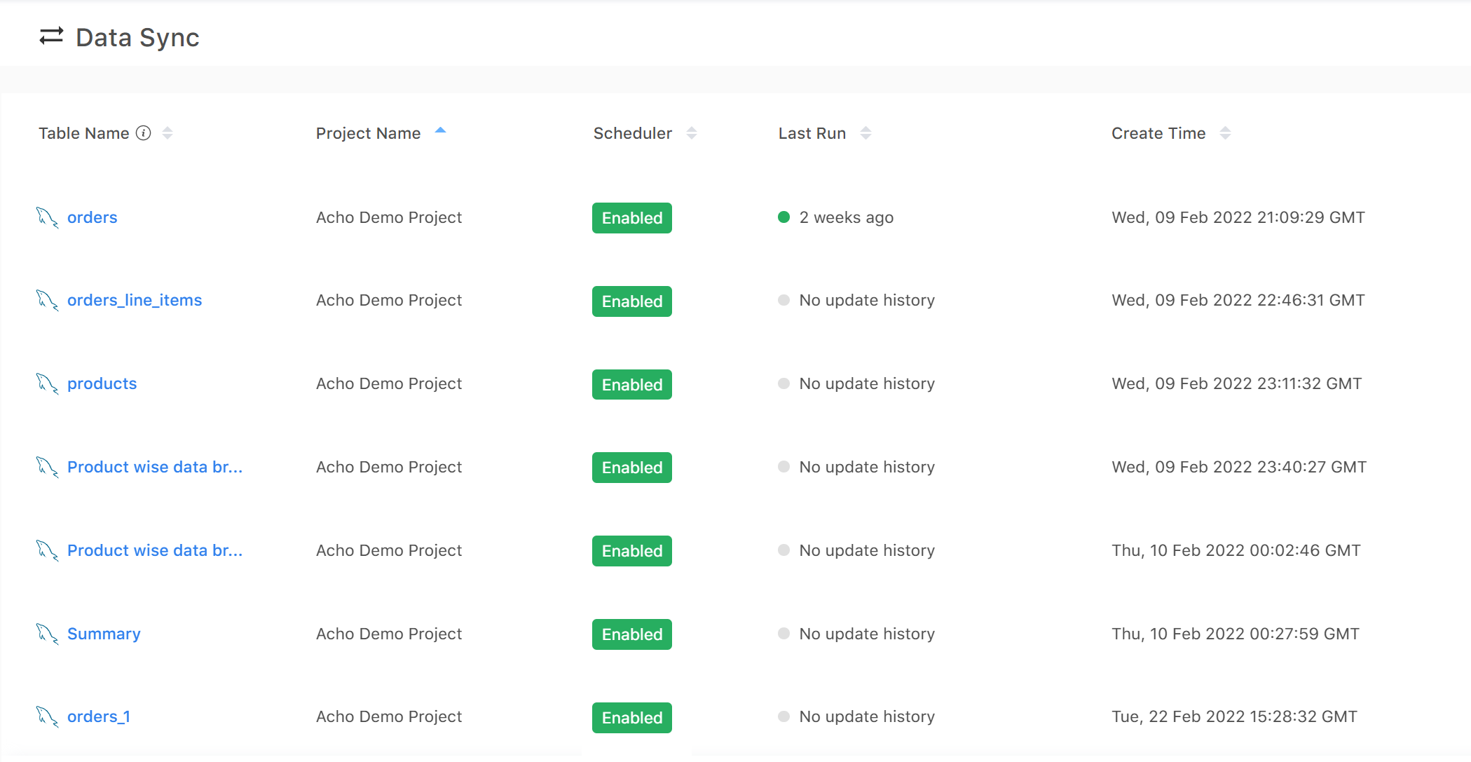
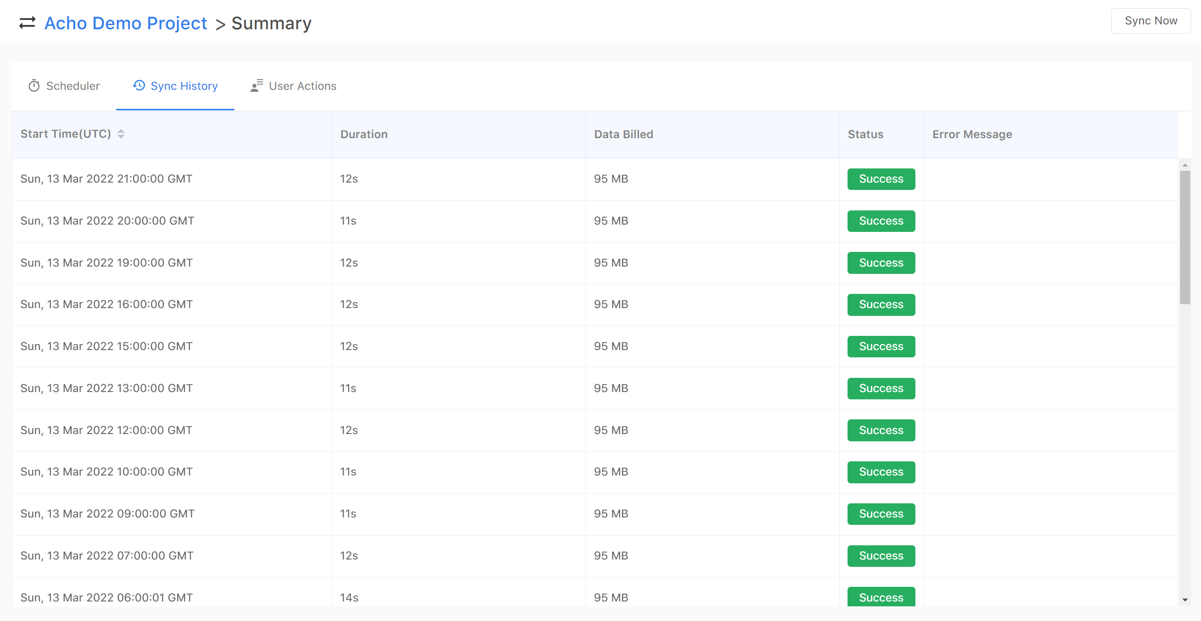
By clicking on one of the pipelines(pipelines come with tables of integrations), you can set up a scheduler, monitor sync history and user action logs. If an error occurs in your pipeline, you can check on the error message and see if you can request another data update manually.
In summary, Acho Studio can help you access and visualize hundreds of GBs of data quickly and efficiently. Since it’s designed as a cloud data warehouse, you can build tables, pipelines and advanced charts all in one place without having to rely on additional resources.
Follow us on Twitter @team_acho for latest product news.
Email us contact@acho.io for any questions you may have