A dashboard is a type of graphical user interface (GUI) which often provides at-a-glance views of key performance indicators (KPIs) relevant to a particular objective or business process. These kinds of visualizations feature a combination of historic data and real-time information that is useful for identifying emerging trends and monitoring efficiency.
It’s quite easy to produce a data visualization with Excel or another spreadsheet program on static, historical data. However, it’s a lot harder to automatically update a spreadsheet for a real-time dashboard. Why?
Why is it hard to build a live dashboard with Excel?
Excel, along with many other spreadsheet programs, are not databases. They are good for storing small amounts of data records with great flexibility in manual data entries. However, they cannot store a larger amount of organized data while maintaining a good schema and indexing method for incremental changes in data. If you tried to sort 1 million rows of data in Excel, it’d easily crash your computer. A database (especially a transactional database such as a SQL database) however, can easily load new data records into a large table while keeping everything in order.
To read more on this subject, you can check out this article on the differences between a database and a spreadsheet.
Can I create a database for Excel files?
Yes, you can! Even though spreadsheet programs are not great for storing, indexing and modeling large amounts of data, you can easily load them into a SQL database. As long as they share a similar set of columns, you can construct a database for these files.
To read more on this subject, you can check out this article: How to build a database with CSV files?
How can we build a live dashboard for the Excel database?
Of course! Once you have an Excel database ready, you can host a live dashboard on it while keeping it updated as long as you load more files into the database.
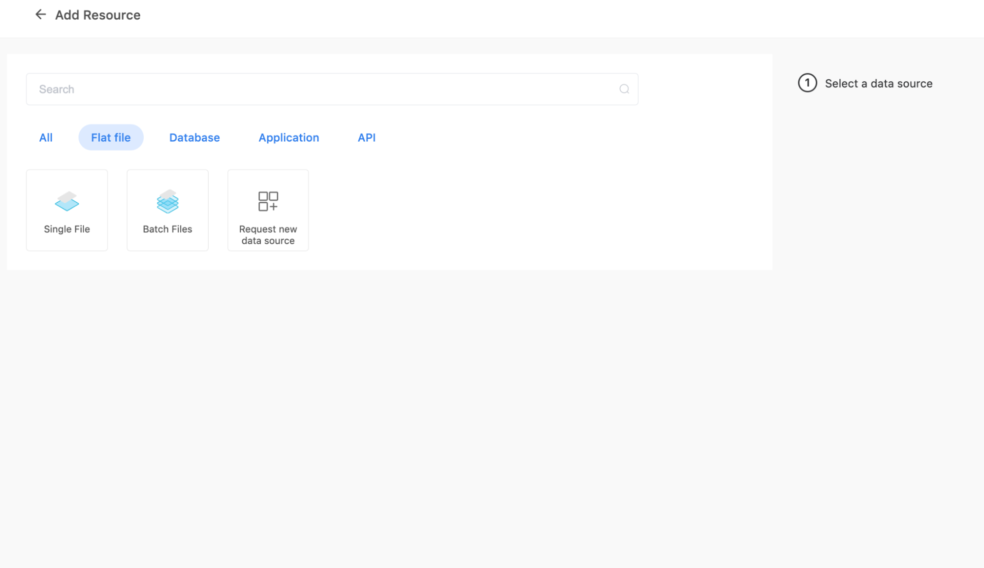
1. Create a “Batch Files” resource for your Excel files
First, you can create a “Batch Files” resource for batching your Excel files. All files in each batch should have the same schema, meaning the same number of columns and the same data type for each column. However, the column names can be different.
There's no limit on the size of each file, though the max number of files currently supported is 100.
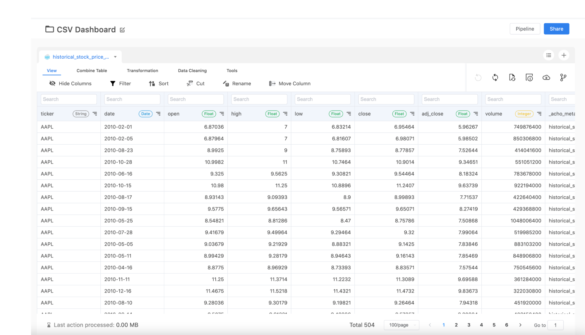
2. Create a data project for your resource
Once you have the resource created, you can now create a data project to access your files. The project is where you’ll be able to view and edit your data. You can apply a series of transformations on your data to deliver the desirable result table.
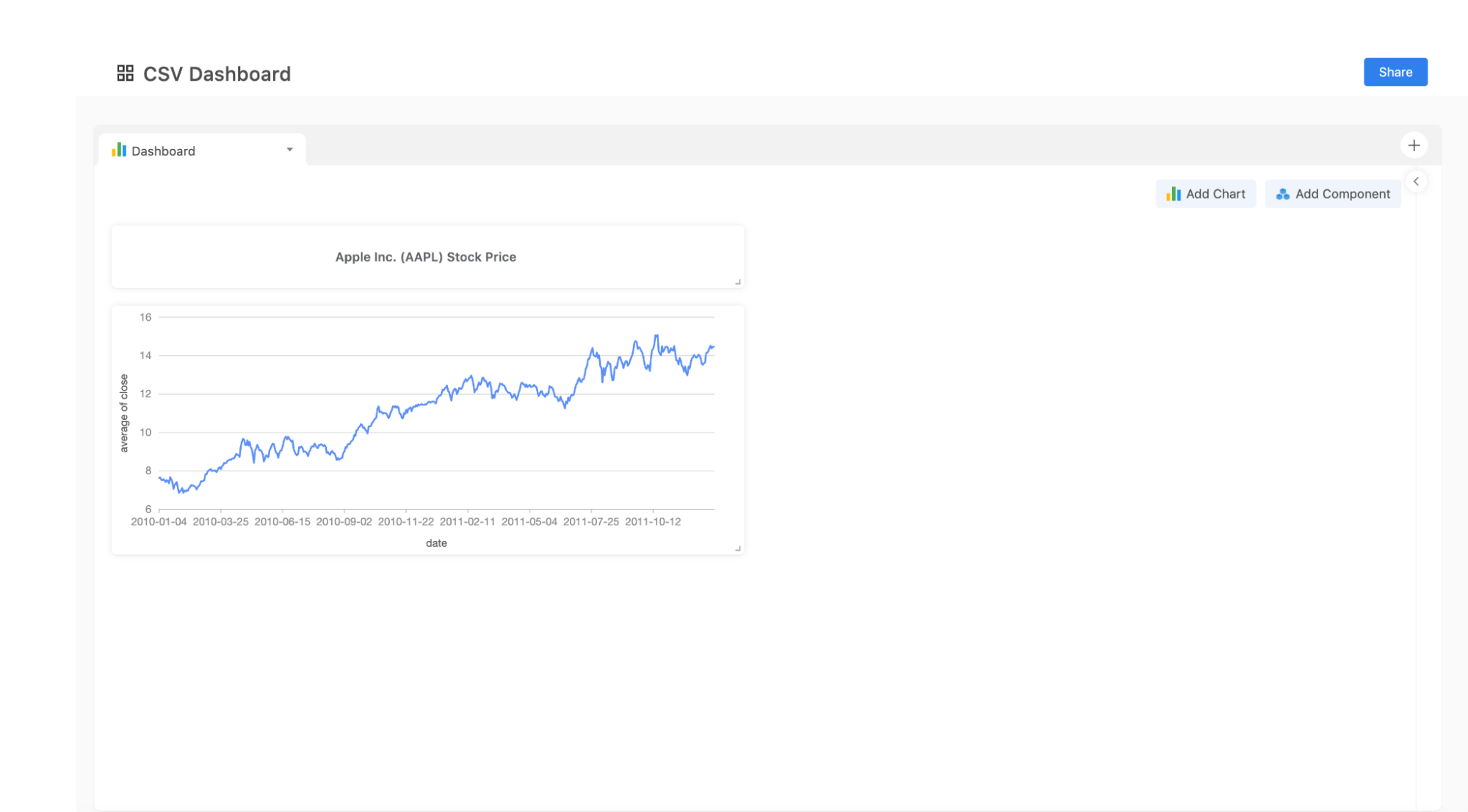
3. Build a dashboard on the data project
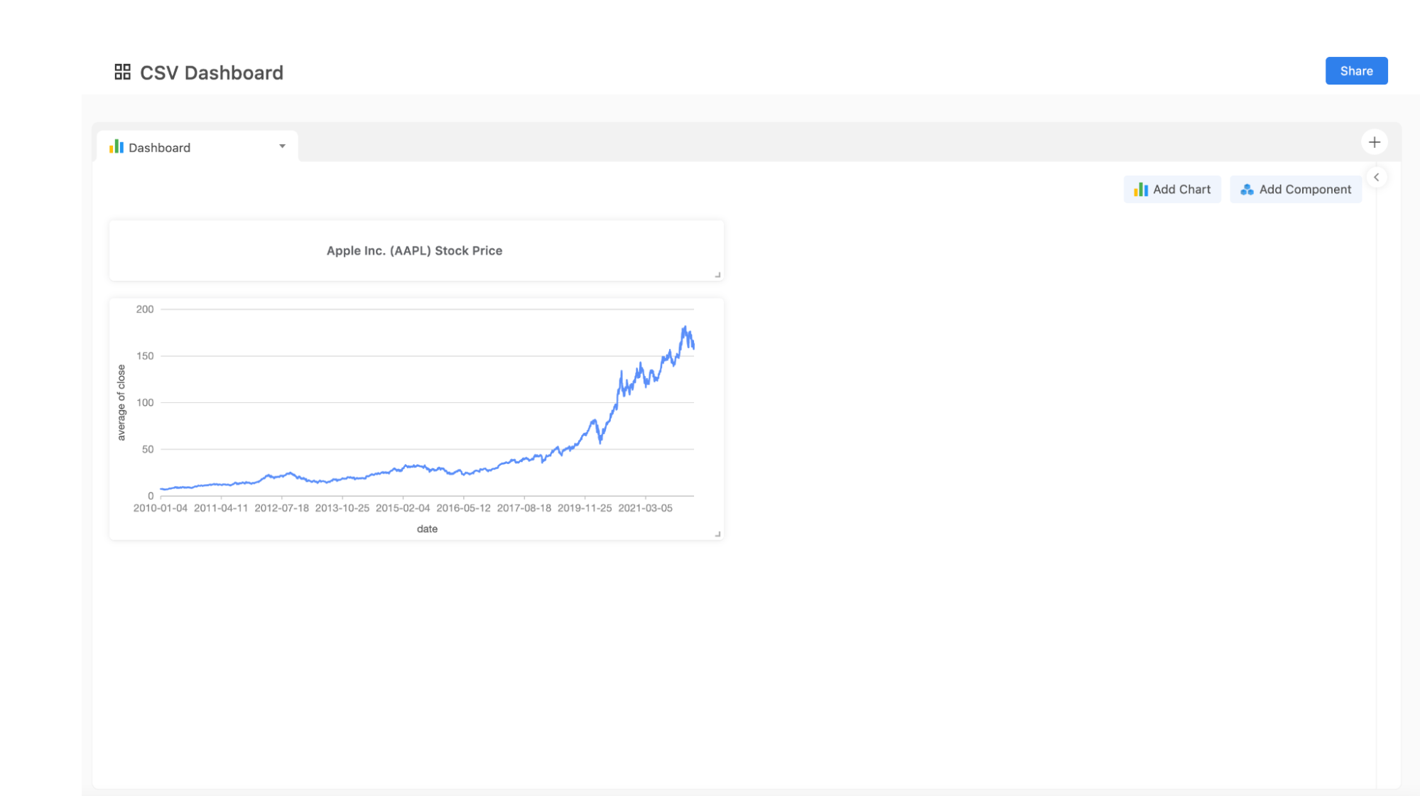
Once you have built your desirable table, it’s now time to turn it into a visualization. Simply go to the “Charting App” to visualize your data in the project. There are many kinds of charts and graphs you choose from. For example, the line chart below visualizes Apple’s stock prices from January 1st 2010 to December 31 2011. Next, let’s update this chart by simply adding a new Excel file.
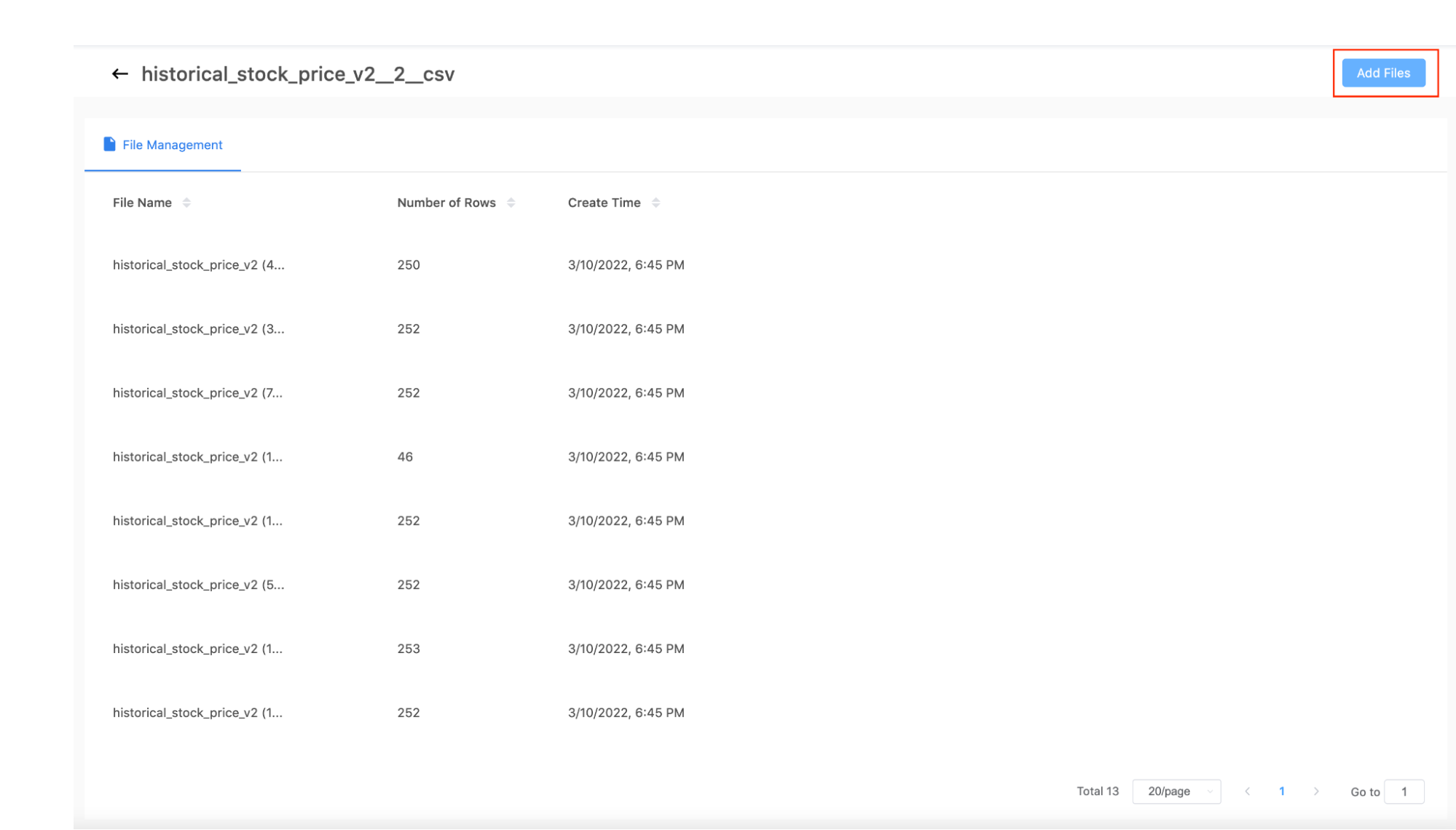
4. Upload more CSV files
When you have a chart built already, you can update it by updating the resource associated with it. Simply go to File Management and click “Add Files” to add more files to the batch. As long as they share the same schema, you can combine the files into one giant table for the project table.
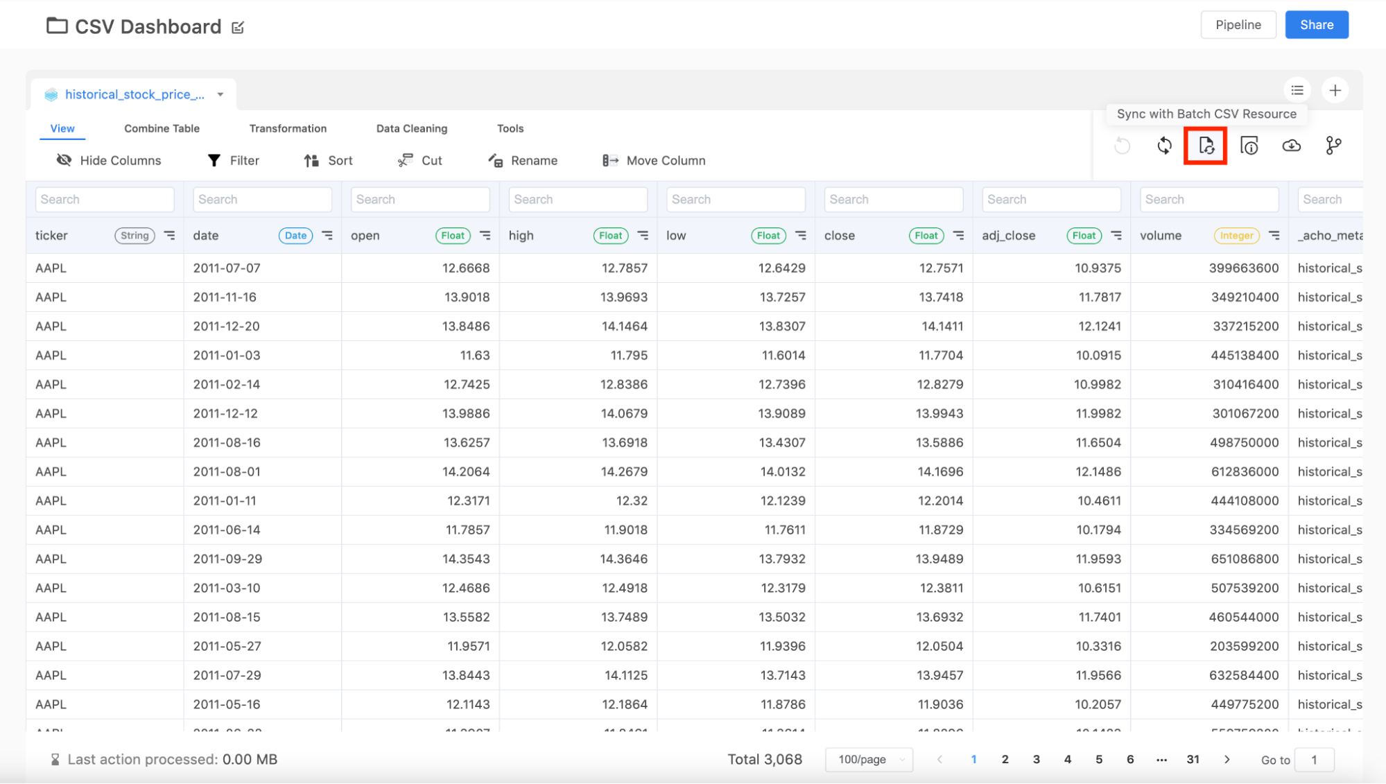
5. Update the project
Once your Batch File resource is updated, you can now update the project. Once you click the sync button, you can update the project table with your new resource. Once the table is updated, you can see the number of the rows increase at the bottom.
6. Watch the dashboard update
Once the project table is updated, your dashboard will be automatically updated. Now you can see that Apple’s stock prices are updated from January 1st 2010 to March 10th 2022. There’s no need to perform any action here in the charting app.
If you’re interested in learning more about this, here’re some way to contact us.
- Schedule a Discovery Call
- Chat with Acho: Chat now
- Email us directly: contact@acho.io