Whether you work in sales, HR, or any department in between, you’re likely asked to make data-driven decisions. A dashboard is a visual display of all your data, intended to provide information at-a-glance through charts, graphs, maps, etc. You can use it to keep track of your KPIs, metrics, and data to extract meaningful insights and quickly identify trends, allowing for more data-driven decisions.
Why Do We Need APIs?
Businesses often use several applications at a time. For example, marketing teams may use Google Ads, Quora Ads, and LinkedIn Ads simultaneously, while also using Sendgrid or HubSpot to run their email campaigns. If a marketer wants to monitor all marketing performances at the same time, they have to switch between different platforms to see and get data.
Business metrics collected by these applications are often difficult to access, locked behind a web interface. For instance, if you want to access more granular data, such as which web pages your customers are viewing or which channel they were acquired from, you’ll need to export this data. While some platforms allow you to download your data into flat files, such as CSV files, the better and more efficient way is to export data via those platforms’ APIs. APIs allow you to bulk export data and update data automatically, saving you the labor of manually uploading data.
Methods to Use Dashboards with APIs
There are several ways to build dashboards with APIs:
- Loading from an API into a database, then using BI tools to visualize the data
- Using built-in API connectors in BI tools
- Using a cloud database platform
Method 1: Loading Into a Database
ETL tools, such as Fivetran or Airbyte, can allow you to ingest data from applications without specifying APIs. However, for APIs that they do not support, you’ll still need to specify APIs by yourself.
Larger companies may have data engineers who can use these tools to load data to an in-house data warehouse and a BI team to get the data from the warehouse and use BI tools to visualize the data. Unfortunately, facilitating this kind of data management requires dedicated engineers and a significant budget for data resources.
Method 2: Built-in API Connectors
A more accessible method would be to load data from an API directly into your BI tool. Many BI tools, such as Tableau and PowerBI, offer built-in connectors for some of the most popular applications. While this allows you to jump right into building your dashboard, there can be limited support for customized APIs.
BI tools are generally straightforward to use, but it does come with some downsides. Their data cleaning capabilities are limited and some data formats, such as JSON, can be difficult to visualize.
Method 3: Cloud Database Platform
Cloud database platforms offer more flexible, affordable, and scalable database management that is especially appealing to smaller companies. Cloud platforms remove a lot of the complications associated with traditional databases. Without the need to self-manage a database, more time can be spent on actually analyzing the data.
These platforms can allow for a more streamlined process to get data directly from their sources to create a dashboard. Cloud database platforms, such as Acho, allow for quick API connections with CSV, JSON, and XML data formats. The data cleaning process is also much easier, giving these platforms capabilities that BI tools might not have.
Here’s how you can use a cloud database platform to build a live dashboard.
Building Your Live Dashboard
Using Acho Studio, you can easily construct a database with your APIs and build a dashboard – all without any coding!
1. Add your resources using the API connector
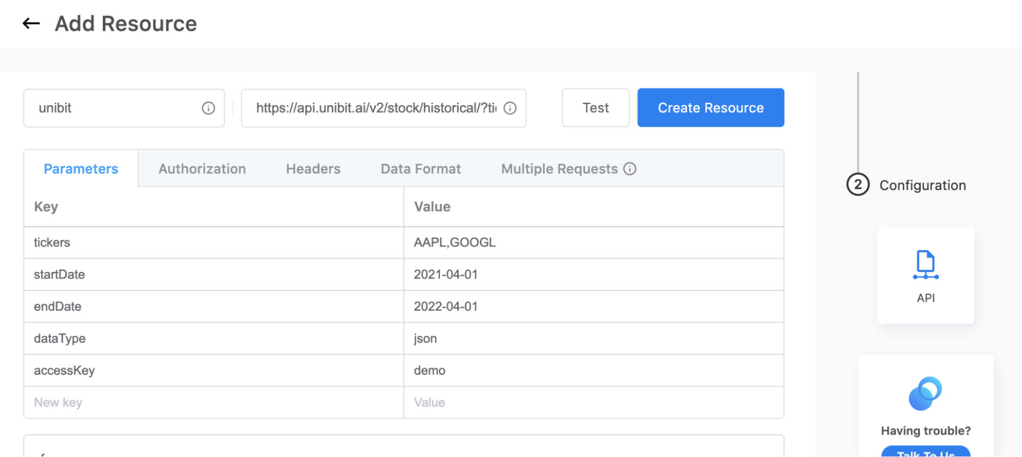
The first step of the process is to create the resources that you want. Using the “API connector” under the resources tab, you’ll be able to configure a connection with the APIs you want. Visit this article for more details on how to set up your connection.

2. Create a project for your resources
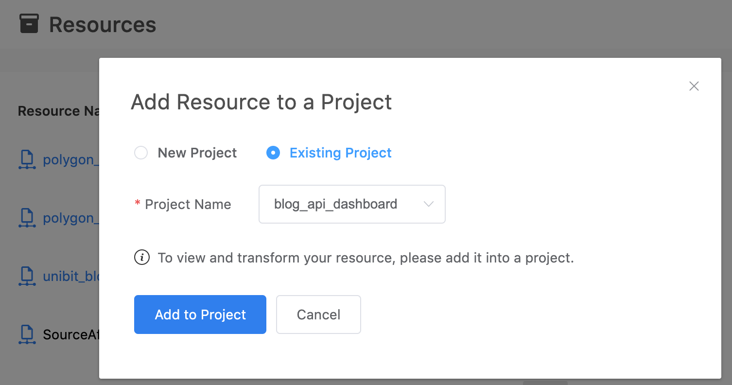
Once you have your resources ready, add them to a data project to access the contents.

3. Transform your data
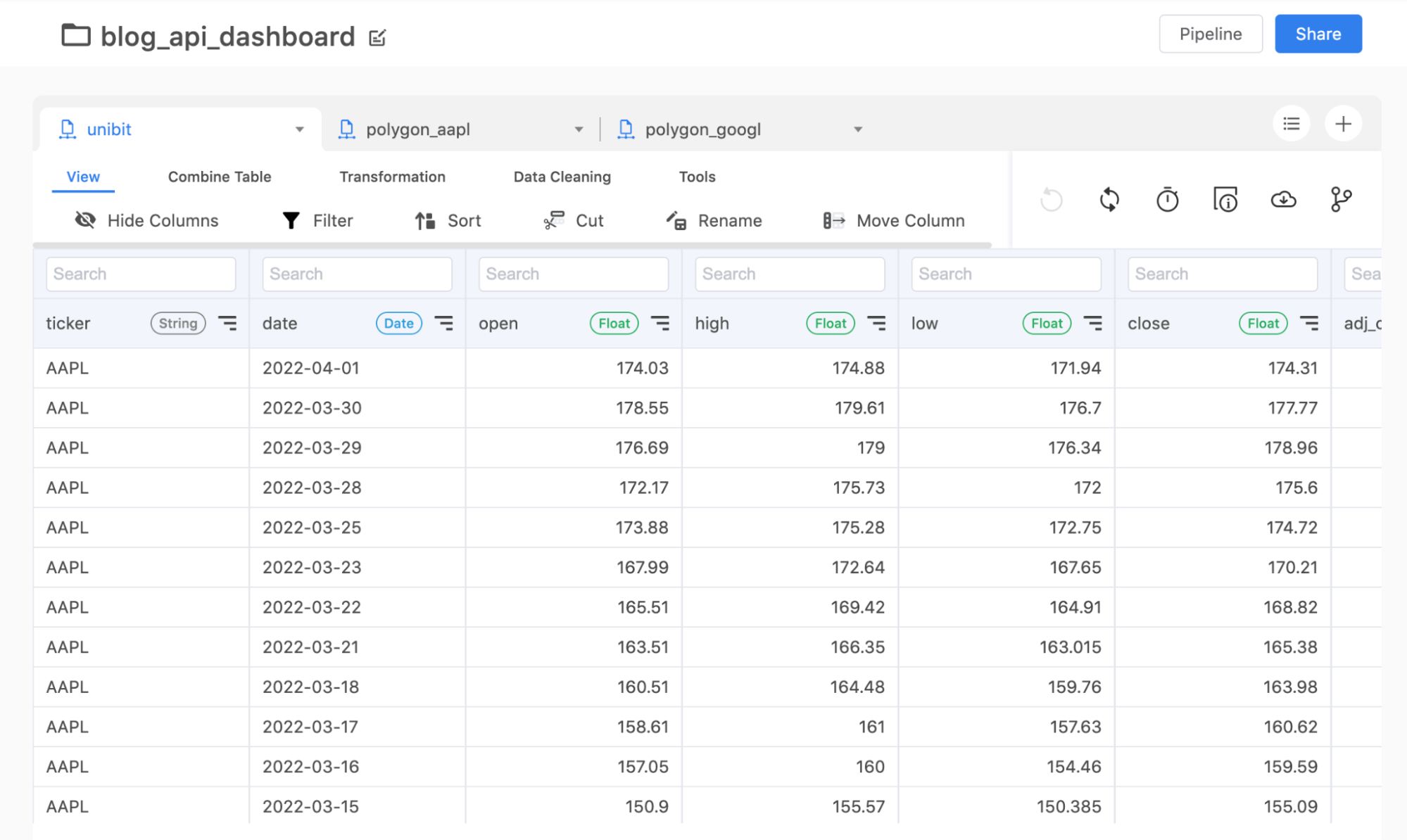
Once you can access your API data, you can transform your data to get your desired table structure. Here, you’ll be able to clean your data, join tables, and make any other changes that you’d like to prepare your tables for the next step.

4. Build your dashboard
By this step, your data project should contain your desired tables. Go to the Charting App to start building your dashboard! You’ll have many visualization options, such as tables, a variety of graphs and charts, and heat maps. Since we have our data all under a project, you’ll easily be able to incorporate data from multiple source APIs in your dashboard. In the below example, the line graph and the area graph pulled data from different APIs.
As your API connection sends updates to the data, your dashboard will also update in real-time! Contact us in the chat box on the bottom right corner of this page if you have any questions!
- Schedule a Discovery Call
- Chat with Acho: Chat now
- Email us directly: contact@acho.io
>>
How to pull data from an API?
>>
How to build an API monitoring dashboard?
>>
How to Build a Web Dashboard Without Hosting a Server